
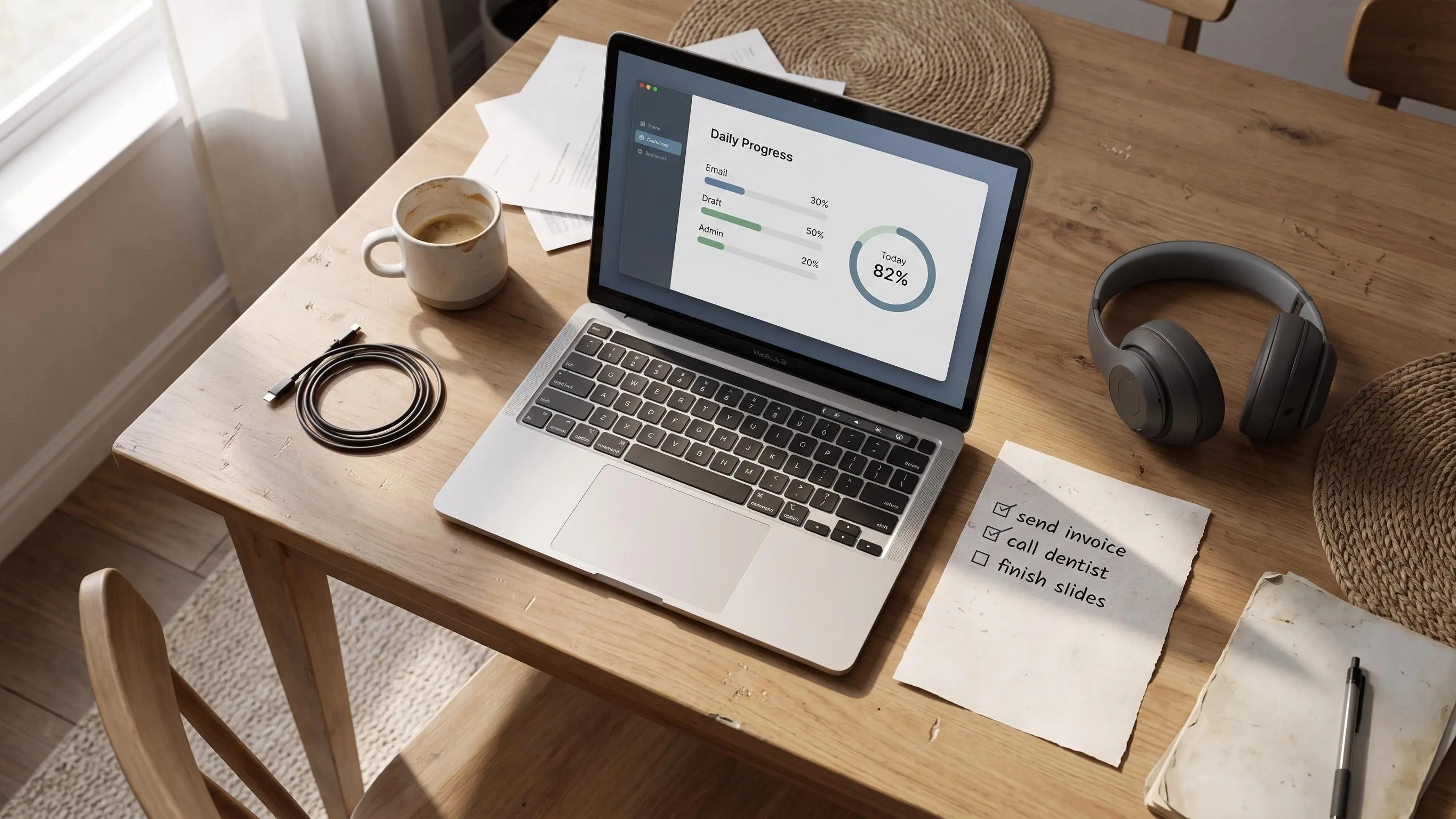
A visual progress tracker can still fail if it only shows time passing. You end up busy, a little fried, and not quite sure what actually moved.
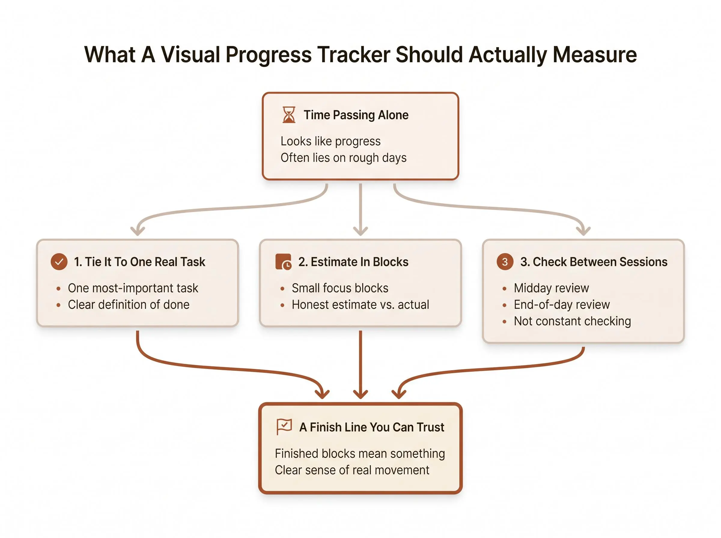
What matters is tying the visual to one real task, keeping the target small, and making finished blocks mean something. We don't need another dashboard. You need a finish line you can trust.
Check these first.
- If it fills from elapsed time, it will lie to you on rough days.
- Estimate in blocks, not vague hours. That's where overplanning shows up.
- Check it between sessions, not every five minutes, so you end clear.
What a Visual Progress Tracker Actually Is
A visual progress tracker is a way to make work visible. Instead of staring at a list or a timer and hoping that counts as progress, you see movement in a shape, a bar, a ring, a timeline, a percentage, or a row of completed focus blocks.
That sounds simple because it is. The point is not decoration. The point is feedback.
A good visual progress tracker answers a few quiet but important questions:
- Is effort actually moving forward?
- How much of today's plan is done?
- What still needs attention?
- Are we finishing anything, or just staying busy?
There are two categories people often mix together.
Time-awareness trackers show time passing. A day bar filling up, a month grid moving along, a countdown clock. Useful, to a point. They tell you the afternoon is disappearing, which is honest if not always comforting.
Work-progress trackers show completed effort. Finished tasks, completed sessions, milestones reached, streaks maintained. These are usually more useful when the problem is not "what time is it?" but "did anything meaningful move?"
That difference matters in practice. People searching for a visual progress tracker usually don't want another timer with nicer colors. They want a visible sense of direction. Something that says, "here's what today's work is, and here's how far through it you are."
You'll usually run into a few common formats:
- Progress bars for projects, milestones, and subtasks
- Rings or circles for daily completion
- Timelines for seeing how the day actually unfolded
- Heatmaps for spotting consistency over weeks
- Changing visual scenes for session progress without staring at numbers
Our view is fairly plain: the best tracker for a calm workday doesn't just show time passing. It shows meaningful progress against a deliberately small plan.
Because time passes whether you focus or not.
Why Visible Progress Feels Calming When To-Do Lists Do Not

Most people aren't looking for a tracker because they love dashboards. They're trying to solve a more annoying problem: the day feels full, but it's hard to say what actually moved.
That vagueness creates background stress. Not dramatic stress. The quieter kind. The kind that sits behind your next task and makes everything feel slightly unfinished.
Visible progress helps because it reduces ambiguity. When you can see completed blocks, a ring closing, or a bar moving, you stop having to guess whether the day counts. You have evidence. Small, but real.
Calm productivity usually comes from clarity, not intensity.
This is where motivation from visible progress becomes more than a slogan. Progress is easier to trust when it is seen, not imagined. A single completed block may not feel impressive in your head. On a ring or timeline, it lands differently. Then the second block joins it. By the third, the day has shape.
Lists don't always do that. In fact, plain lists often do the opposite.
A to-do list can grow faster than it shrinks. It collects requests, errands, half-formed intentions, and guilt in one place. You end up with pressure without momentum. Lots of obligation. Not much signal.
Visual systems also help if you struggle with time blindness or abstract planning. The day becomes concrete. Not "I should probably work on the report sometime this afternoon," but "two of four blocks are done, one is left before lunch." That's easier to act on.
There is one catch. Visible progress should support focus, not become another thing to perform for. If you're checking the tracker every six minutes to feel productive, the tracker has quietly become the problem.
The Most Useful Visual Formats for a Workday
Different formats do different jobs. Some are good for planning. Some are better for reflection. Some are mostly there to stop you from drifting.
Progress bars
Progress bars are strong when work is structured. Projects, milestones, chapters, deliverables, subtasks. If you can break the work into parts or estimate a real percentage, bars are useful.
They work well for:
- long reports
- semester projects
- product launches
- research with clear stages
They're less helpful when the day itself is the problem. A progress bar can tell you the project is 42% done. It won't necessarily tell you whether this morning was well spent.
Daily rings or circles
This is where progress circle productivity makes sense in everyday use. Circles are intuitive. You don't need to read them. You glance, and you know whether the day is open, half-done, or nearly closed.
A daily completion ring is especially good when your plan is short and session-based. Complete a focus block, fill a segment. Repeat. It's clean. Not flashy. Just enough structure to keep you honest.
It also gives the day a finish line, which is rarer than it should be.
Session timelines or activity blocks
Timelines are useful for seeing where time actually went. Not where you meant it to go. Where it went.
They help you spot:
- fragmentation
- repeated context switching
- long gaps between sessions
- hidden admin drift
If you've ever finished at 5:30 and thought, "how did that become a whole day," a timeline will answer with uncomfortable detail.
Heatmaps
Heatmaps are less useful in the moment and more useful later. They show consistency over weeks or months. Great for noticing patterns like "Tuesdays are realistic, Fridays are fantasy" or "you focus better in the first two hours than after 3 PM."
Quietly useful. Not daily-driver useful.
Ambient or scene-based visuals
Some people find numeric countdowns a little too sharp. Ambient progress cues can help. A scene changes, a visual journey advances, a session looks like it's moving without shouting numbers at you.
That can reduce timer stress. Just don't confuse soothing visuals with a working system.
Time-progress displays
Day bars and life bars are good for perspective. They can remind you that time is finite, which was already true. They are weaker for actual task execution because they show time passing, not meaningful work getting done.
Useful as context. Thin as guidance.
Daily Progress Ring Meaning: What the Ring Should and Should Not Represent
The daily progress ring meaning is straightforward: it's a visual record of your workday plan being completed, one deliberate block at a time.
That's it. Not your identity. Not your work ethic. Not your value as a person before coffee.
Rings work because they do three things well:
- they're easy to scan
- they create a visible finish line
- they frame work as finite and closeable
A good daily completion ring should measure completed planned focus blocks, progress on a chosen most-important task, and honest follow-through on a small set of commitments.
It should not measure:
- nonstop busyness
- every minute at your desk
- impossible all-day perfection
- whether you answered messages quickly enough to satisfy the internet
This is an important distinction. A ring built on elapsed time says, "you were present." A ring built on completed work says, "you moved something forward." Those are not the same.
A ring should close because work was completed, not because the clock kept ticking.
The ring works best when the plan exists before the session starts. Otherwise you're just filling a circle with activity and calling it progress. Plenty of adults do this for years.
There is also a psychological benefit that doesn't get enough credit. Closing a ring gives the day a clean endpoint. That matters. Without an endpoint, work keeps leaking into the evening as a vague unfinished feeling. The task may be incomplete, but the day's commitment can still be complete. That's a healthier line.
Why a Planner-First Tracker Works Better Than a Timer Alone
A common frustration with focus apps is that they help you start working but don't help you decide what the work is for. You get a clean timer, maybe some background sounds, maybe a small tree grows. Fine. But the hard part was never clicking start.
A standalone timer answers one question: how long did you work?
A planner-linked visual progress tracker answers two better questions:
- what moved forward?
- did the day match your intent?
That difference is bigger than it sounds. Some tools are built around session visuals. Some are built around project dashboards. Some give you a tidy timeline after the fact. The missing layer for a lot of people is choosing one clear priority before the clock starts.
That's the planner-first idea we use in Flocus.
You choose one most-important task, estimate it in focus blocks, run those blocks inside the same system, and fill a daily Focus Ring as sessions are completed. The tracker isn't separate from the plan. That's the whole point.
The estimate-versus-actual layer matters even more. It turns the tracker into feedback instead of reward. If you thought a task needed two blocks and it actually needed four, that's not failure. That's planning data. Honest systems leave a paper trail.
Calm focus usually comes from reducing open loops before you begin. Not from trying to manufacture motivation halfway through a distracted afternoon.
How to Build a Calm Workday Around One Visible Metric
You do not need six metrics and a second monitor full of charts. One visible metric is usually enough if it reflects real work.
Here's a practical way to set it up.
Choose one most-important task.
One priority creates clarity faster than ranking ten tasks against each other. Secondary tasks can exist, but the main visual should anchor to the work that would make the day feel worthwhile.Define completion in plain language.
Finished draft. Solved problem set. Reviewed one chapter. Prepared the presentation outline. If completion stays vague, the tracker will stay vague too.Estimate in focus blocks, not vague hours.
Blocks are easier to picture and easier to track. "Three blocks" is more concrete than "work on it for a while."Decide what fills the ring or bar.
Usually each completed block. If the work is highly structured, a milestone or subtask can fill it instead.Keep the target small enough to close.
This is where most people get reckless. If the ring needs eight perfect hours to finish, it becomes a guilt meter.Review twice.
Once around midday, once at the end. Not every ten minutes.
A few grounded examples:
- A student studies one chapter in three blocks
- A knowledge worker writes a report in four blocks
- A team lead prepares slides in two blocks plus one review block
Small plans calm the day down. Big plans make the tracker look ambitious and the person using it tired.
How to See Your Workday Progress Without Micromanaging Every Minute
The tracker should support attention, not sit on your shoulder asking for updates.
Before work starts, set the plan, estimate the blocks, and make the visual target visible. That should take a few minutes, not a morning ritual. If setup becomes its own hobby, something has gone wrong.
During a focus block, let the timer or visual signal run quietly in the background. Don't keep checking analytics. The job of the block is to work. Not to monitor yourself working.
At natural checkpoints, ask a simple question: does this block count toward the ring? If yes, mark it. If the work took longer than expected, adjust the remaining plan. Quietly. Without drama.
A midday review helps because it catches the most common failure mode: the day gets hijacked before the priority has real momentum. Look at the plan and ask, "is the important thing genuinely moving?" If not, protect another block for it before adding new obligations.
By the end of the day, review the ring and the plan together:
- did the ring reflect real progress?
- where were the estimates off?
- what's one lesson for tomorrow?
That is enough.
Seeing your workday progress is useful when it answers a decision question. Should you protect another block? Shrink the plan? Stop for the day? Curiosity alone is not a workflow.
The Data That Helps and the Data That Distracts
Not all productivity data improves focus. Some of it just gives your procrastination better graphics.
The most useful metrics in a calm visual system are usually pretty modest:
- completed focus blocks
- completion of the daily priority
- estimate versus actual time
- streaks that reflect real consistency
- weekly patterns that show when plans are realistic
That last one matters more than people expect. A pattern that says you reliably get two deep blocks before lunch is more useful than a heroic plan for six.
Less useful data tends to look impressive and help very little:
- vanity totals with no link to important work
- raw hours without context
- too many tags, categories, and scores in a basic daily flow
Heatmaps can be excellent for pattern spotting over time. Timelines reveal fragmentation. Long-term bars help with deadlines. Day-progress bars alone often create urgency without direction, which is a very modern problem.
In daily use, a ring plus a short reflection is often enough. That's part of why a lightweight system like the Flocus Daily Planner works for many people. A short plan, a visible ring, and reflections drawn from real completed days gives you signal without turning the day into data entry.
Common Mistakes That Make a Visual Tracker Feel Stressful
A tracker usually becomes stressful in predictable ways. Not because visual systems are bad, but because people ask them to carry too much.
A few common mistakes show up fast:
- tracking too many things at once
- making the target too large to finish in a normal day
- using a ring to represent busyness instead of meaningful progress
- confusing time elapsed with work completed
- turning the tool into a performance display
- ignoring estimate-versus-actual gaps
- relying on a motivational interface without a clear task decision underneath it
- treating missed days like moral failure
That last one needs saying plainly. Imperfect days are normal. Returnability matters more than streak perfection.
The best tracker is one you'll still trust after a messy Tuesday.
If a system only feels good on your best days, it isn't helping you live. It's grading a performance.
Choosing the Right Visual Progress Tracker for Your Style of Work
Pick based on your bottleneck, not on feature volume.
If time keeps slipping away, a timeline or day-progress view may help. If starting is the problem, session-based visuals or ambient progress cues can reduce friction. If finishing meaningful work is the issue, a daily ring linked to a plan is usually stronger. If you're managing a large project, structured bars, subtasks, and deadlines may be necessary.
Privacy can matter too. Some people want minimal tracking, local handling of data, or fewer accounts in the stack. Fair enough. The right tool is partly about what you'll tolerate.
If you want one place to plan and focus, the Flocus Focus Timer is useful for a simple reason: it runs from planned tasks instead of living as a separate countdown app. That sounds minor until you've spent a week timing sessions that never connect back to anything.
Use this checklist before choosing:
- Does it help you choose what matters before the timer starts?
- Can you see progress at a glance?
- Does it show completion, not just elapsed time?
- Does it help you review what was realistic?
- Will you still want to use it on an ordinary Tuesday?
Ordinary Tuesday is the real test. Not launch day. Not New Year energy.
When You Want to Measure More Than Time
Most visible progress systems measure output and consistency. That's enough for most people. But some readers want to understand focus quality too.
A timer can show duration. A ring can show completion. Neither can tell you whether your attention inside the block was steady or scattered. That's a different question.
For readers who already own a Muse headband or are genuinely curious about measured focus, Flocus Flow Tracking adds that layer. It can show a live flow score during work and classify states like Flow, Overload, and Low Engagement. Used well, it's an observational tool, not a party trick.
The useful attitude here is simple: notice, don't worship. Neurofeedback can help deep workers connect visible progress with the quality of attention over time. It can also become gadget theater if you expect it to replace a plan.
The core system still works without hardware. It should.
Conclusion
A visual progress tracker is most helpful when it makes meaningful work visible. Not when it makes you feel watched by a metric.
For a calm workday, the approach is usually simple: choose one important task, break it into a small number of focus blocks, use a daily completion ring or similar visual to show steady progress, and review what was realistic at the end of the day.
Keep it honest. Keep it small enough to close.
If you want a practical next step, choose one visual metric to trust this week. Just one. Make it simple enough that by the end of the day you feel clear, not judged.
Article Record
ReferencesPrimary sources used for this article
- Tactido – Focus Timer & Session Tracker for iPhone and Android
- FocusFlow — ADHD Pomodoro Timer App | Free Android
- Focus Tracker App - App Store
- Life Progress - Chrome Web Store
- Habit Tracker for Mac - Visual Daily Routine Planner | NoNoise
- Focustra - Get more done. Every day.
- Progress — Android Progress Tracking App for Goals, Projects & Tasks